Yoono
The more Yoono
Project overview
Yoono is a people intelligence platform built for organisations making high-consequence decisions about individuals. As the business moved beyond its recruitment-adjacent roots into the regulated, risk and compliance space, we were brought in to reposition the brand. The challenge was to create an identity that matched the platform's sophistication: credible under scrutiny, confident at board level, and built for the next stage of Yoono’s growth.
Strategy
Our strategy centred on a simple shift: from providing information to enabling better-informed decisions. Yoono brings disparate information together to give decision-makers a deeper, clearer understanding of the people they are assessing. The brand needed to communicate intelligence without complexity, authority without corporate stiffness, and technology without falling into familiar SaaS conventions. Every decision was guided by clarity, structure and trust.
Brand Strategy
Brand Identity
Brand Activation


Project details
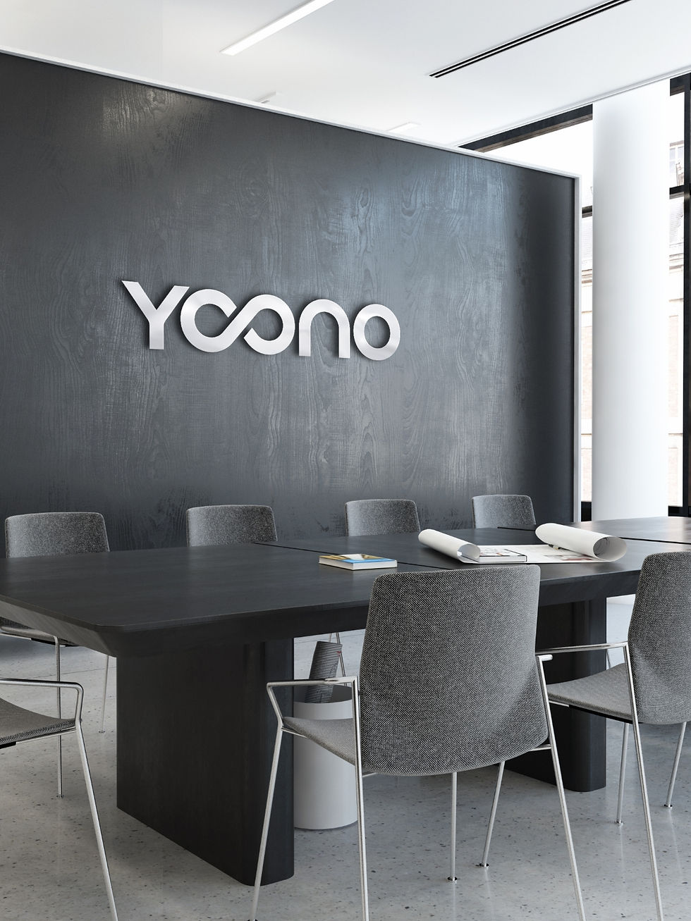
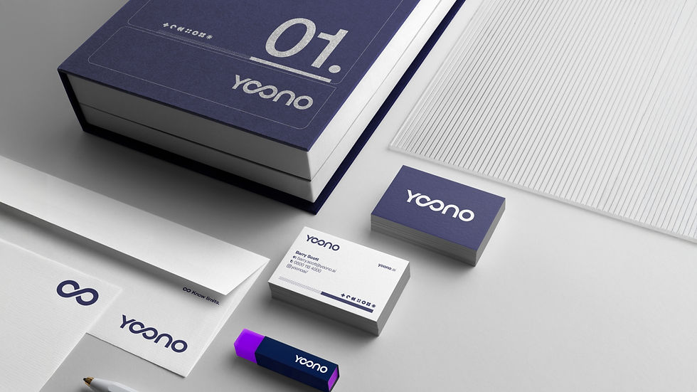
The new identity is built around connection, convergence and a more complete view. At its heart is a refined Yoono marque, with interlocking forms creating a distinctive symbol that reflects continuous intelligence and multiple sources resolving into one clearer picture. A disciplined typographic system, deep navy palette and modular graphic language give Yoono a more authoritative presence while providing the flexibility needed across communications.
From the outset, the identity was designed as a digital system, not simply a logo. Working across Yoono’s website and the wider UI/UX experience, we developed a visual language where structured layouts, modular forms, data and interface elements all feel part of the same brand. The result gives Yoono a consistent foundation that can move from marketing and presentations into the product itself, making complex information feel considered, accessible and easier to act on.

The challenge was to make Yoono feel as intelligent and considered as the platform itself, without losing clarity or character.
Luke Vidamour - Creative Director