Keda
Engineered Precision
Project overview
Keda needed a visual identity and website that reflected the strength and scale of its construction and crane hire expertise. We built on the company’s existing logo to create a confident, contemporary brand presence, bringing greater clarity to its services and putting its projects and people at the forefront.

Project details
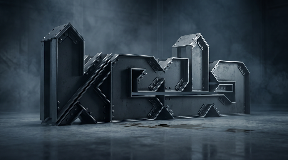
Inspired by the idea of ‘Engineered Precision’, we developed a visual language rooted in the angular geometry of Keda’s existing mark. Strong diagonal forms echo steelwork and structural engineering, supported by a disciplined blue palette and bold, clean typography. Industrial imagery and a distinctive steel-rendered logo treatment bring texture and character to the identity, connecting the brand directly to the materials and craftsmanship behind its work.


