
PottingShed
Probably the Most Improved Logo Ever
27 January 2013

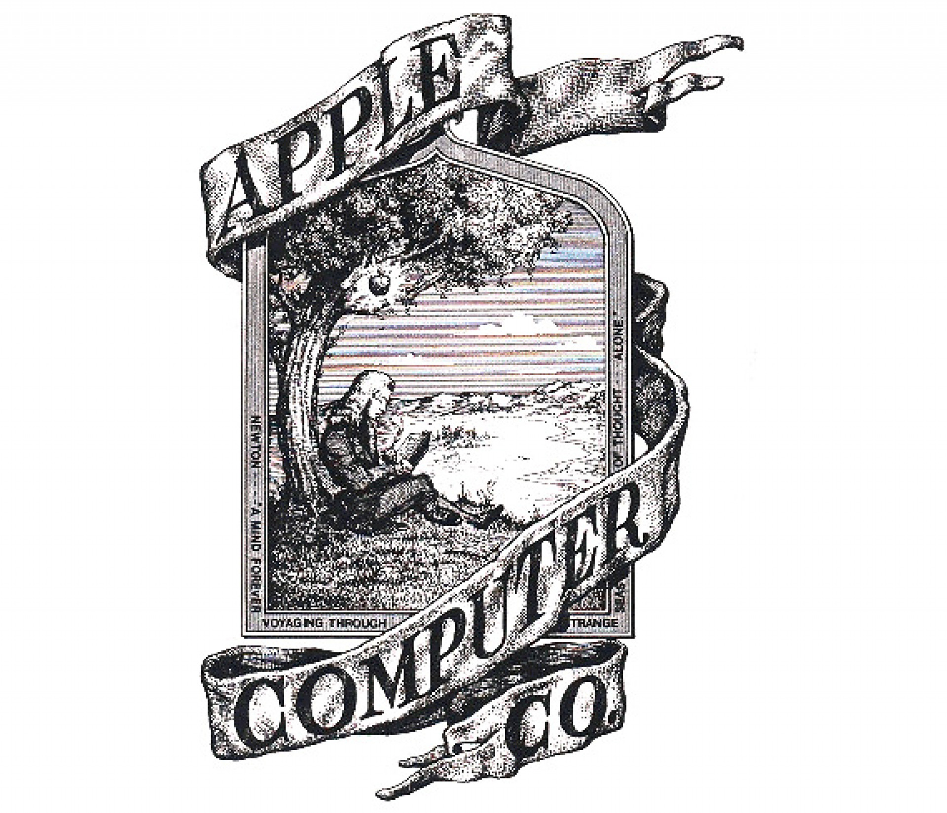
It has become one of the most admired and recognisable identities in corporate history, the apex of a brand which has the ability to make consumers buy high end electronics before they even really know what they do or if they really need them. However the first Apple logo was not quite the design tour de force you see here.
Believe it or not this is the original Apple logo! It was designed in 1976 by Ronald Wayne, sometimes referred to as the third co-founder of Apple. The logo depicts Isaac Newton sitting under a tree, an apple dangling precipitously above his head. The phrase on the outside border reads...
Newton… A Mind Forever Voyaging Through Strange Seas of Thought … Alone.
Not surprisingly, the above logo only lasted a year before Steve Jobs commissioned graphic designer Rob Janoff to come up with something, a little bit more modern.
Janoff said recently in an interview for the website Creative Bits:
Really there was no brief. But the really funny thing was the only direction we got from Steve Jobs is: “don’t make it cute”. Ron did a pen and ink drawing of Sir Isaac Newton sitting under an Apple tree with a poem all around the border. And, I think when Steve Jobs started to get serious about the Apple II and getting a prototype for the design of the shell he realized that logo would not do. So he needed a new logo.
According to Janoff, the “bite” in the Apple logo was originally implemented so that people would know that it represented an apple, and not a tomato. It also lent itself to a nerdy play on words (bite/byte), a fitting reference for a tech company.
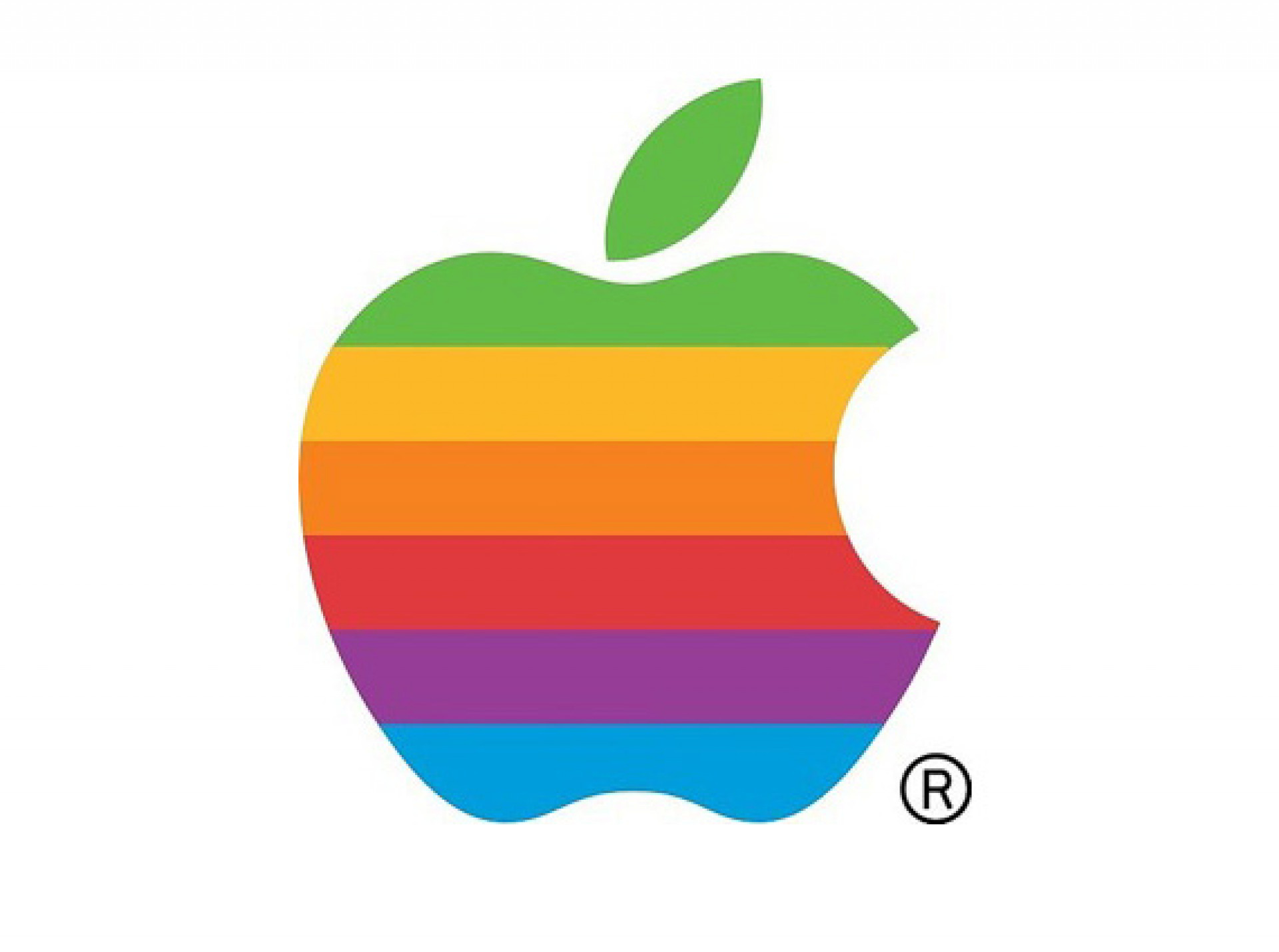
Asked If the psychedelic times the logo was created in were the inspiration for the multicoloured elements Janoff said “Partially it was a really big influence. Both Steve and I came from that place, but the real solid reason for the stripes was that the Apple II was the first home or personal computer that could reproduce images on the monitor in color. So it represents color bars on the screen. Also, it was an attempt to make the logo very accessible to everyone, especially to young people so that Steve could get them into schools.”
Steve Jobs is rumored to have insisted on using a colorful logo as a means to “humanize” the company. Janoff has said that there was no rhyme or reason behind the placement of the colors themselves, noting that he wanted to have green at the top “because that’s where the leaf was.”
The relatively simple origins of the rainbow colored Apple logo hasn’t stopped some from reading a bit too much into what it represents. Jean-Louis Gassée, former Apple executive and founder of BeOS, quipped about the logo:
One of the deep mysteries to me is our logo, the symbol of lust and knowledge, bitten into, all crossed with the colors of the rainbow in the wrong order. You couldn’t dream a more appropriate logo: lust, knowledge, hope and anarchy.
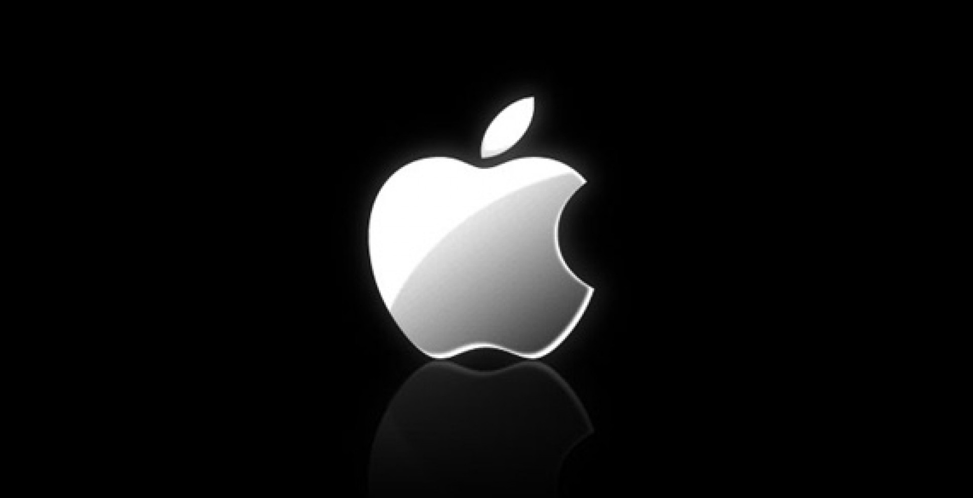
The multi-colored Apple logo was in use for 22 years before it was axed by Steve Jobs less than a year after his return to Apple in 1997. One of the key reasons being how expensive it was to print 6 spot colours when reproducing the icon. In its place was a new logo that did away with the colorful stripes and replaced it with a more modern monochromatic look that has taken on a variety of sizes and colors over the past few years. The overall shape of the logo, however, remains unchanged from its original inception 33 years ago.

Testimonials
"Potting Shed took the time to understand the product and our purpose and created a clean, fun and fresh look which our clients comment on regularly. They then took the brand and product to the next level for us by creating our product video and website, and the storyboard and visual process that the team created really brought it to life."
.jpg)
Jenny Winspear
COO Anova
"We worked alongside Potting Shed to create an identity that embodies who we are, and why we do what we do. These projects have contributed to a more connected team who believe in our organisation at a deep level. When your people believe in what you do and take ownership over their culture and workplace, growth is the natural outcome."
.jpg)
Jim Gilligan
CEO Carey Group
"Potting Shed responded quickly and sensitively to our brief, helping us find a tone of voice we're genuinely proud of. Their promptness and understanding made a real difference – 10/10 for quality, service, and value."

Jay Goss
Bank Aston