
PottingShed
A Sight for Sore Eyes
20 March 2015
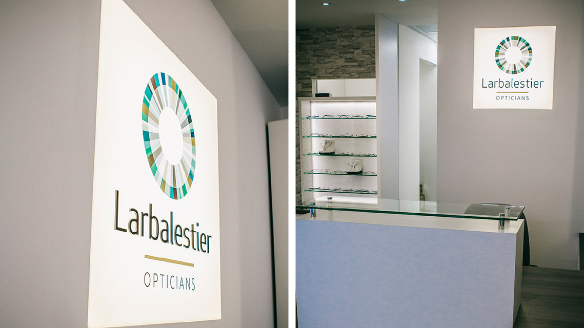
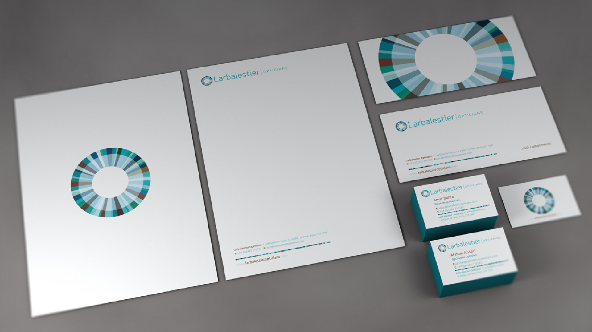
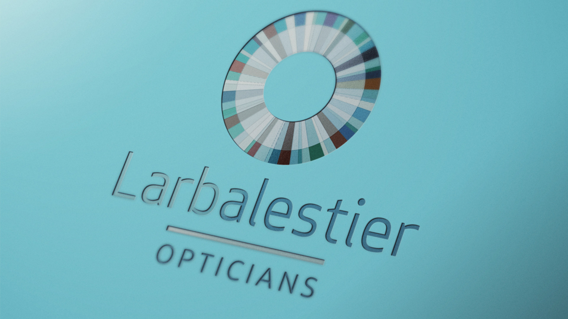
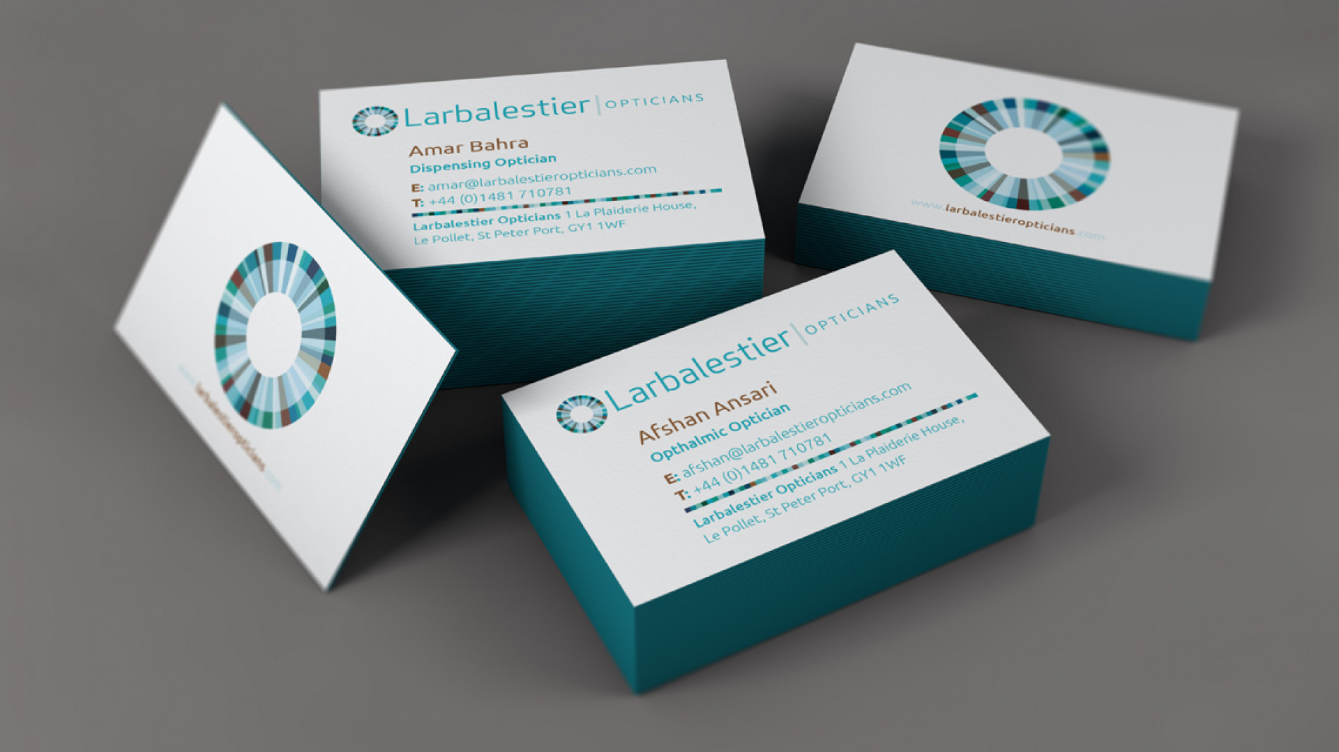
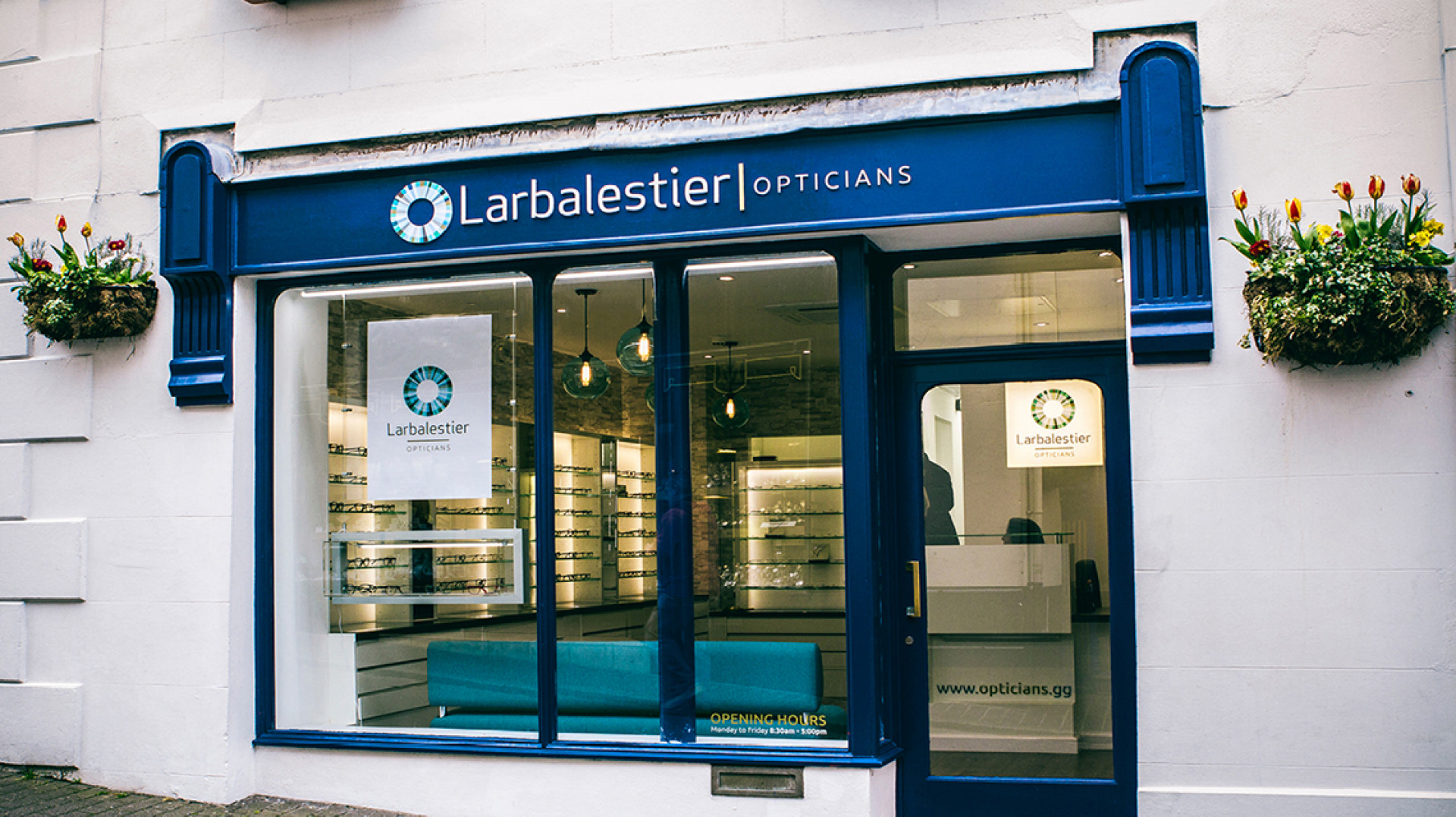
The new owners of Larbelestier Opticians, Afshan Ansari and Amar Bahra contacted us a while back about rebranding their business. The aim was to move from the somewhat dated and traditional feel of the old brand towards a more forward facing and clinical direction.
This brand is all about focus, clarity and colour. The colours found in the cornea are referenced, whilst being allowed to breathe in plenty of white space the multitude of colours in the brand keep the marque vibrant and allow it to avoid the feeling of being too cold. Once again there is scope here to play with the spectral range of the icon in the future, taking on different hues and segment widths / combinations to create sub-brands or artwork for interiors / brochure ware.
There's more to come from the team at Larbelestier in the future and we look forward to showing you that soon.

Testimonials
"Potting Shed took the time to understand the product and our purpose and created a clean, fun and fresh look which our clients comment on regularly. They then took the brand and product to the next level for us by creating our product video and website, and the storyboard and visual process that the team created really brought it to life."
.jpg)
Jenny Winspear
COO Anova
"We worked alongside Potting Shed to create an identity that embodies who we are, and why we do what we do. These projects have contributed to a more connected team who believe in our organisation at a deep level. When your people believe in what you do and take ownership over their culture and workplace, growth is the natural outcome."
.jpg)
Jim Gilligan
CEO Carey Group
"Potting Shed responded quickly and sensitively to our brief, helping us find a tone of voice we're genuinely proud of. Their promptness and understanding made a real difference – 10/10 for quality, service, and value."

Jay Goss
Bank Aston